Exercise: diegetic and non diegetic sound

The exercise consists in identifying different kind of sounds used in films. When making it, the line between diegetic and non diegetic sound should be clear. These are the examples to practice and understand how the soundscape contributes either to create an specific atmosphere or merely to enhance the shots. 

Intentional confusion of diegetic and non-diegetic sound. I've chosen a scene from a series where a man is running around a neighborhood. He wears clothes for running and uses earphones. We listen to music as we see how things evolve. Apparently, this music is a soundtrack but once the guy stops, the music stops as well. This is because he has removed the earphones from his ears. So, we had been listening to the music that the protagonist was listening to. This means, it was in truth diegetic sound and not non-diegetic. I have to say that I really like this trick. 


Sound that is hard to identify as either diegetic and non-diegetic. I couldn't find any examples of this. But, as soon as I found one, I'll post it. 

Music (non-diegetic) used to identify social and cultural references. I chose the last scene of the film 'Slumdog millionaire". We see there a group of dancers together the two protagonists, dancing while an Indian song is being played. I must admit that it might be considered as nos typical, due to the people are not dressed as the Indiand stereotype. Yet I think the example is good.  


Music and other non-diegetic sound used to create, for example, atmosphere, tension and emotion. In this case I picked a film called Fargo. There's no music at all there but when particular things happen. For instance, a woman is kidnapped and, when the kidnappers are going to meet the rescuers - with the money - we listen to music that builds up an atmosphere of tension. 


Non-diegetic sound that sets the pace of a scene and non-diegetic sound that give cues to action. I put these two together as I found another scene in the previously mentioned Fargo that contains both ideas. We see a man trying to fix a TV. Music is behind, accompanies the footage. The man can't fix the TV set up and started to hit it. Music turns louder until the last punch, when we can see the screen clear and there's no sound. That's because we are seeing another telly, that of the house of a woman who is relaxed at home.  


Exercise: two people communicating

For this exercise I was told to produce a short sequence in which two peope communicate across an off-screen space. To complete the work I had to start filling the gaps of a scene given beforehand. This scene was as follows - added words are in capital letters:
Sarah is seated alone. She is holding something (a book, mobile, other item) that has her attention. She seems distracted, absorbed by what she holds. 
Dan is standing NEAR off across the STREET. He notices Sarah but looks away. 
Sarah looks up for a moment and notices Dan. She reacts with indifference and continues to look at Dan. 
Then he becomes aware that Sarah is looking at him. He looks up at her. 
Sarah smiles at Dan. 
Dan begins to walk towards Sarah. 
Besides the script, I had to take other instructions. I couldn't use wide shots - essential to create the idea of the off-screen space and each shot had to contain ony one of the two characters. 

So, with all these things I sketched out all the frames. The plan is below: 


And that was the result:


Evaluation

Having a look at this film, I must say that I can't see if the off-screen space was achieved or not. I think that it was, but, being sincere, I don't really know. It might be said that the backgoud -the wall - gives coherence to the whole movie and helps us to understand that the two characters are in the same place. But, does this mean that a viewer will interpret that there's a short distance between them? I doubt it. Anyway, I believe that I put what I was asked to put and probably, what is left is basically an atmosphere. Although there was that point indicating to show a reaction of her, I didn't do it. What is more, the truth is that nothing happens there. What's going on here? Nobody knows. Because of that, I consider the exercise a failure. Not too big, but a failure. And that's not good. 

How could I have solved this? Well, I dare to say that making an effort on framing, would have had a fantastic result. I mean, let's imagine for a while a mid shot where we can see a potential linking element. And the character is placed as it wass sketched out previously, which is at one side of the frame. Just having done this instead of having used angles, might have had a better result. And of course, we could have been able to see linking elements apart from the wall. 

A good example of this, Richard's blog. Both protagonists are well placed and the road is the key connection between them. A bad example, MarĂ­a's blog. She did something quite similar to my story, but it's even more difficult to follow the narrative. And she admitted this.

Assignment 2 - Creating atmosphere

The second assignment consists in creating atmosphere by combining all the elements that it were  shown in parts 1 and 2. This means, framing, lighting, sound and the like. It took me a while to do this but in the end, it was done and this is the result.


Planning

I ran into this idea accidentally. It was a foggy day in Cardiff Bay and I decided to go out to film some shots of the peculiar atmosphere that we had then. Out of the blue, I filmed a scene where silouttes of people just came off the fog as zombies. That sparked this project. I already knew that it was going to be a scary film as it's the easiest way of creating a specific mood but, that was an irresistible opportunity that I couldn't miss out. So, just when I was there, I started to imagine how my storyborads could be. I must admit that I got some pictures with the sketeches only in my mind but, as I've just said, the chance was too good for not making the most of it. 

Furthermore, the place was my daily way to get the swimming pool, which was the coastline path. Some days, when I was cycling back home, the route seemed th be lonely and misteryous. As I said before, the thick fog catched me by surprise and as I've always thought that light contributes more than framing to create feelings, the set was ideal. The fog conveyed cold. If I was able to film high angles and wide shots to have a sense of threat, my assignment was ready to be produced.

Eventually, the list of shots was as follows:


Shot 1. Wide of shot of a man getting away from a bunch of weird figures. The atmosphere is created by the natural light. It is very white and as a consequence, very cold. That gives us a feeling of discomfort. 

Shot 2. Mid shot of the guy running. The camera follows him as to reinforce the sensation of tension with tilting and panning. 

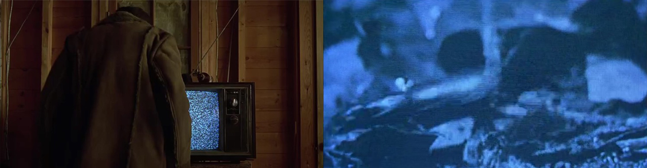
Shot 3. Mid shot of the guy running. It's important to show the fog in the background to have a continuity in which the threat is still there. 

Shot 4. Close up of the shoes. This is a transition shot that intends to be artistic. It is related to the narrative but it has nothing to do with the lighting.

Shot 5. Wide shot of the man running. By having a wide framing, I understand that the scenario will be clearer. That helps to think that the guy is close to a safety place. 

Shot 6. Wide shot of the protagonist coming into his building. It's just a transition shot to keep going with the plot. 

Shot 7. Mid shot of this man going up by the stairs. Now the light is different. It starts to be warmer as the danger is getting further behind. 

Shot 8. Mid shot. The man arrives safely. He come into his house. The light is warm because he is not at risk anymor. Or maybe he is. That's the reason why there is a high angle here. 

Shot 9. Close up, His face shows relief. But he can't rest assured. Something or someone knocks on the door. He opens the door again and here it goes, a shed of white light comes in. That brings the cold atmosphere back again. Finally the guy screams. This last part is filmed in a different shot, TO be precise, it uses the high angle mentioned befor. I didn't draw it - but that was my intention. 


The sketches are below: 


And the sequence is the following one. Enjoy it:


Evaluation


First of all I want to say that I'm quite happy with my work. Above all, there's something there and that's important. Moving to the evaluation, the shots previously thought, were clearly not enough to compose the narrative. That's why I put a brief introduction together with the title 'The fog'. This is probably the biggest failure of the movie. Even when the pictures are nice, it's not good to add things once you've planned everything. That's a sign of bad thinking and sometimes it could be fatal for a project. So, next time I must be more careful when making notes of the things that I want to get. 

Aside from that, I'm very satisfied of how the sequence works, being logic from the beggining to the end. This means that you can isolated any shot and it's possible to say that what you have, belongs with this story. Another positive that I can take away from this is the combination of lighting and framing, working togehter in the same direction. For the first shots, lighting is in charge of everything although the information showed also sums to get fear and terror. However, once the protagonist is at home, framing is the key factor. The high angle when the man closes the door, it has to be understood as the danger is still there.  

Regarding framing, it would have been ok to play a little bit more with subjective points of views as they can create stress and tension. This is probably the big mistake it was made. Even more, panning or tilting would have helped too. As this is a scary movie, to cause discomfort on the audience beyond the light and the shot angles, would have worked very very well. It had to be something wrong. 

Finally, I'd like to comment on the sound. There's a scream in the end that shows a good understanding of the use of diegetic sound. The source is obviously the man who has just suffered an attack by the figures that came from the fog. There was no need to film anything else. It's in my opinion, the perfect end in terms of atmosphere and mood created by three different techniques. 

In conclusion, I should pay more attention on planning and try to have a go at other kinds of sensations which are not as simple in their composition as a trhiller. For example, a comedy. Besides, to use other techniques of filming could be welcome - subjective view, panning, tilting, etc. 

Listening

This exercise is divided into two parts. The first one asks for listening to the silent in different places. The second one, consists in looking backt at one of the sequences that I filmed before and identify all the things that produce a sound and describe the sound after that. There's a list of sensations to link to these sounds. 

I started by the second part. The sequence that I picked it up was the story of the alcoholic who was alone at home - the instructions read that it had to be the project two the basis for this but there was no filming there so I went for project number three. There are five items that make noise here: the bottle, its top and the liquid within it, the bell ringing and the glass. So, let's see how they work when they are dissaciated from the narrative. 

The bottle. It sounds sharply and loudly when the guy leaves it over the table. It's probably one of the sounds that have more quality. You can hear it clearly. It's exactly the same for the glass, And I describe them as violence. I mean, they are in truth two knocks on the table that happen quickly and strongly. Like a beat. 

Then, I have the top of the bottle when is opened. The quality is not very good but you can hear how it goes along the mechanism to produce the action of liding. It sounds to me like a stream or a day out in the forest. Because it is something that has continuity and finally ends up in something else that is bigger - the sea in the case of the stream, the act of pouring liquid in the case of the bottle. 

The liquid - wine for this film - would be like the previous sound described but is also reminded me diver in the deep blue sea. So, although the quality is not good again, I would say that this sound could be described as blue and clear - we are in a coral reef. 

Finally and talking about the bell, it has to say that this is music so, aside that is played on the film in an audible volume, I think that an orchestra comes to my mind when I hear it. Probably a group of violinists. That's how O would describe this last sound.    

And now, the silence. I've listened to the silence in two different places. One was the bedroom, just after waking up. The other was the corridor of my floor. And these are my notes on this:

The silence in the bedroom is warm and slow. And you don't want to be anywhere but there. It seems like if you left the room, nasty things would happen to you. Moreover, this silent is so nice that you don't want to have anything breaking it. Not even a whisper. So, you're just there, enjoying that noise that represents peace and harmony. Aside from that, another thing that came to my mind when I was listening to this was a jigsaw with all its elements put rightly all together. 


Talking about the silence in the corridor, I have to say that I chose this one because I thought that it was going to be the opposite to the previous one. And that was exactly what I had. A silence which was very cold and goes fastly. A very uncomfortable lack of noise. And the only thing that you want is precisely not to stay, to get away as soon as possible. It's also the noise of work. And it's also the noise of that that you don't want to have it. Fear, uncertainty, distress. 


A new soundtrack

As I did for my first listening exercise, I had to look back at the sequence of the alcoholic man. Then, it was time to record again all the sounds that could be improved - that is to say, all of them - and laid the new tracks underneath the picture. As there were not too many sounds, it was not difficult to make it. Although the result was not as good as you could imagine according to that low level of difficulty that has been mentioned. The problem here was, firstly, not having an atmos to create sound continuity. I should have recorded that and I didn't - please, don't ask me why. Besides, the synch is not very good and some sounds don't seem to be natural. Anyway, I think that the new soundtrack works well and, in my opinion, that should be taken above all. So, mission acompplished. Moreover, it's difficult to notice that the new recordings were done afterwards. 

This is the new sequence


Having a look at other students exercises, I must start, once again, with the warmer than here blog. I think that she did well in removing sounds from the camera. Furthermore, the synchronization is very good. Finally, credit to her as well because she created continuity by recording the sound of a coffe machine between shots. I really liked it and I note that it was a good resource. 

Now I'm writing about Helen's blog. This is very interesting work because this girl uses the sound not only as a companion with the pictures - that provides the film with logic - but also as an element to reinforce the meaning of the story. In this case, she re-recorded all the noises that contributed to create the atmosphere of a hangover. 

Use of colour

This is an exercise of viewing that intends to understand how the colour is used in films. To achieve the goal I was supposed to watch and observe films that use the colour in a particular way. There was some instructions to follow that helped me as I was going along this. To be precise, I was supposed to look for the examples below:

1. Change of atmospheres between scenes.
2. Emotion of a character.
3. General mood or atmosphere of the film as a whole. 
4. A range of feelings, emotions or atmospheres such as love, fear, power and joy. 

So, having taken this into account, I have found the following frames to illustrate the four ideas. 

Firstly, I would like to comment a change between scenes that I watched in the film Her. It represents the feelings of the protagonist. He was in love a few years ago and happily married but currently, he is getting divorced. And we can see the contrast between the two stages of his life when he thinks about them. From white to black. Furthermore, these two work well as examples of how love and joy are shot. The low intensity of the whites avoids a cold sense. In fact, it gets the opposite, warming the whole scene. On the other hand, when the guy is stressed, dark tones are predominant.


Keeping working with this movie, its photography is so colourful that it was pretty easy to get more wanted samples. Basically, the colour is used all the time to show the audiencie the mood of the main character. When he is in the mood, he appears within a setting painted by a wide range of colours. At the same time, when he is feeling blue, it is all in the opposite coloration as it was mentioned before. The chosen frames show power. The guy looks confident and, as matter of fact, he really is. And we know this thanks to his red shirt. 


Finally, I would like to present four frames from Harry Potter and the prisoner of Azkaban. This film has a very particular atmosphere. I think that this is because the narrative is so dark and reads about a prisoner who is regarded as dangerous. Obviously, we barely see colours in the film. What is more, when there's something that should be on the screen lively because of their colour, they make them less vivid. This can be clearly seen in the bottom left where there is a girl wearing a pink hoodie. Pink is usually a cheering colour. But not here.  

Reflected light

According to the instructions, I had to frame an object closely that was alight by a light at one side. On the other side, I had to hold up a sheet of white paper. The idea was to notice how much light was bounced back at the object. And I had to repeat the experiment using other surfaces as reflectors. So, I did what I was asked for and that was what I achieved.

Firstly, on the top left of the picture, we can see the object without any reflected light. As it happened, its left side is in the shade. At the same time, the right one is sharpened by the light source. Once I started to use reflectors the texture was softened and the light that was bounced back, caused the removal of part of the shadows. The colour was also affected. Specially for the last photo. The reflector in this case was an orange surface so the atmosphere created was warm. In contrast with the first capture, that was very cold, is remarkable the change produced. The other surface was a green one, similar to the orange. That's the reason why both images look so similar.


Atmosphere

In this exercise I've been asked to record two short scenes where I should create atmosphere by combining lighting, shade and colour. There were different choices to film and I finally went for the following two: 

A depressed person alone at home

Before I started, I could visualize in my mind a scene alighted with a very low source in terms of intensity. In this manner I thought that I was going to have a very dark scenario. Moreover, the source of light had to be cold, very cold. The idea was to convey a feeling of disturbance and, as consequence, make the audience willing to stop watching the sequence or, at least, to wish a change for another atmosphere, happier and more illuminated. So, to achieve that I believed that only one white light would be enough. As I did in previous exercises, I took my bike light and I recorded a person alone at home, doing nothing and alighted only by the cycling element. I didn't use any additional stuff. 

What I acieved was something scary but not depressing. I must confess that it was a little bit disappointing to see that. And having reflected on what happened, I can point three big mistakes. The first one is the lack of consistency in every single aspect that contributes to build up the climax. The light is different from one shot to another. But not only the light. The texture is also different. The first picutre is sharper than the other two. The second error was having filmed at night. It's clear to me now that the perfect location would have been a room where the blinds stop the light that comes through the windows. In all probability I wouldn't have needed any artificial sources - either reflectors or something lije that - because it seems that that would have been enough to create the atmosphere that I was looking for. There's nothing more depressed than a dark room when outdoors the sun is shining - or, it's daytime. And finally, there is no clue about the origin of the light in the first shot. In conclusion, I'm not happy with my final cut.  

Another mundane day at the office

My intention here was to capture all the essence of an office that is well represented for a very white light. In principle, it looked easy to do this. It was just a matter of going to my work and film. However, I considered another way of making it - among other things, because I don't work. Given that the corridor of my block is as dull as an office, I imagined a scene when the worker gets home after a long and boring day. That's another part of the routine. That is to say, the man comes off the lift, walks along the hallway, opens the door and walks into his house with a look of resignation. This means that the lights of the building were, in my opinion, enough to get the desired atmosphere. If I wasn't wrong, the colour and texture would be ideal to offer a sense of boringness. 

In this case, the result was optimum. It all worked as it was expected. And I didn't use anything else apart from the things that I had. In contrast with the depressed film, I achieved what I wanted to achieve.


Comparing techniques - looking at other student's works

As usual, I'd like to start by having a look at my colleague MarĂ­a from the "Warmer than here" blog. She explains to us that this was not her most succesful work. However, I do think that she did really well. Let's see how she achieved. She  recorded the romantic dinner scene and the beautiful day one. In the first scene she created a very warm atmosphere with a candle. Probably, it was the obvious choice but, what was not so obvious was the contrast between the setting alight with and without the candle. The texture and the colour change a lot. Actually, without the candle, the illumination is flat and dull. Once the candle is there, the feeling perceived is othe. You really want to be there, having dinner with her. Something similar happens to the second sequence. Just with the daylight. Raising a blind and the sense of being on a very beautifil day is achieved. Again, it could be said that this is basic. And it's true. But, likewise it was in the dinner, the transition from a dark room to a clear one, is significant and it has been acomplished. 

The other student blog I accesed was the "Rjdown" of Richard. He did the stalker and another video that I didn't understand very well. In fact, talking about the latter, I think that there was nothing to comment on it as there was no atmosphere at all created by the lighting. On the contrary, the other sequence worked well as the sense of discomfort that the author intended to show was defintely there. The stalker is in the middle of the night and we can see that clearly through the window. What is more, due to the lighting source outside, when the man put his face against the door, his eyes turned into a strange kind of alien eyes. Furthermore, there's a shade on his face because the light at the door comes from one side. This is a good technique. To sum up, I believe that this video was a aligned to the spirit of the instructions. Although I doubt if that was the intention or it was accidental. 

Viewing light levels

This exercise is about finding good examples of light levels changing radically within a scene and explaining how these changes are justified. On reflection, it has to be said that I consider this task as one of the easiest so far. I struggled to compose the shots of creating depth with lighting. This is true. However, after having experienced with that, it's quite clear to me the use of sources of light. So, according to this and applying the rule that warm light means comfort and cold light the opposite, I'd like to expose the following stills:

Picture 1: This first example shows a man in his living room. The light is warm as this is a space where he feels good. The problem is that the place is connected to another room through a door. And in this room is happening something that is not convenient for the man. Thus, when opening the door his relaxation is gone. And we can see clearly the contrast between the two atmospheres. The first one has a light which is warm and pleasant. On the other hand, the second one, has a very cold light. Obviously, the character is not happy at all after the quiet environment is brought into disruption.   


Picture 2: In this case, there's an action that causes the change. There's no two different scenarios. Just a lamp that has been switched off after being thrown on to the floor. This motivates going from a nice lighting to total darkness. And the variation reflects well the mood of the protagonist. Before, he was thoughtful - although he was angry too. Afterwards, he is very mad at something and it all goes black because  of that.  

Viewing balance

What is pretended here is understanding the rule of thirds. To achieve the goal is recommended to analysed part of the work that I've already produced. Sometimes, it will feel that I've followed this guideline of composition, whereas in other cases it will be just the opposite. At least, that is what I thought. However, going over my previous work reflects that I was always close to what was expected. Probably because I didn't pay too much attention to the things that I could get when not applying the Golden Section. I mean, I don't know that I could alter the message conveyed by my footage just by composing my frame in a different manner from the academic one. Therefore, my examples are not very interesting. Actually, I think that I'm a very big fan of the rule of thirds so I guess that it should be good for me to begin with a little experimentation.

Picture 1: Funnily, I didn't take on any lighting thing because I really liked the overexposure effect that the window makes it. Otherwise, the composition is pretty avarage. I wonder if I could get another impression from this having played a little bit with the composition. We'll never know. 


Picutre 2: Likewise happens in the picture just mentioned, this is a shot that fits well with the theory. And I could have made the most of it whether I had changed the arrangement of elements within it. Given that this is the decisive moment of the sequence and, besides, the drama is there, it seems that it is not a good idea to be very conservative.  


Once my productions have been reviewed, it's time to look for good samples in real life. So, starting by a broken composition balanced between shots, I would like to introduce this one from a thriller, "The Village". Two characters are having a conversation about what love is and the like and, all of a sudden, the one with the long hair stabbed the other one. Then. the rule of thirds is not any longer there, I suppose, because this helps to create tension and distress.


Another interesting still captured comes from the series "House of Cards". It shows three people in a significant disagreement. And to upset the viewers in a manner that can feel themseves part of the scene, the protagonists are not at all where they shoud have been. if the situation were a relaxing one.  


Finally, it's my intention to present how changing the position of a subject on the screen can give us a totally different sensation about what we're watching. But firstly, let me explain the narrative here. We have a man who is very confident on his stance in a discussion with another man. As the conversation between them goes along, this confident disappears entirely ought to something else that the other man has said to him. So, moving to the shots, on the one hand we have this guy perfectly placed when his pretty sure about what he is talking about. His eye line and the bottle of beer makes the harmony which the rule of thirds needs. On the other hand, once the bad news for him has been broken, we can see him not in the middle of the frame or located in a line a third of the way in from either the right or the left. In this manner, his strain is perfectly noticed by the audience. 

Depth

This exercise consisted in finding a place where I could frame a shot that contained a close and a distant object. Once this would have been done, it had to be noticed that, when zooming in on the close object, the distant one was out of focus. Conversely, when zooming out while keeping the two elements in frame, the background one came into focus. That was because of the depth of field, which was increasing as zooming out. Furthermore, the objects appeared to move apart. 

The scene that I shot was the one below: 

Images with depth

The instructions for this work were to produce three images that each represent a particular atmosphere considering lines of perspective, foreground and background detail, lighting, colour and texture, and depth of field. 

And these are the things that I achieved:

Dynamic/exciting/adventurous

This first still represents a silouette which is in all probability the simplest exercise that we can make with colour. That is to say, a black figure in the foreground and a very bright background. Furthermore, in this example, as the contrast creates depth, we can feel a sense of risk given that the closer object seems to be flying over the top of the building - that we can see at the back thanks to the depth of field mentioned. What is more, the slight diagonal of it contributes a little bit to have an impression of movement. But it must be admitted that you have to be very generous to concede that. 


Oppressive/dull/stifling

In this case I went for getting a still of the utilities room, as it is a very much obvious space that can be identified as dull and oppressive. I put a light in the middle of the room to produce depth and, in addition to this, I included the door slighlty alit to make contrast ought to the difference in texture - the wood against the space full of stuff. There are other things to sum to the deepness such as the lines of perspective - althoug they were not totally captured - and the hoover's tube. 


Complicated/confusing/uncomfortable

One of the things that I read when I was preparing to construct my images was that hard lights on the face os subjects can shadow considerably things that offer value information about how they feel. At the same time, not softening these shadows has got a significant consequece: contrast creation. I thought about this when I had to get a still that makes us uncomfortable and confusing. The result was the folowing one. A woman's face, half lit, half shadowed, looking down in the foreground. How is really she? It's difficult to say because we can't take too much information away from her appearance. Apart from this effect, I put two more lights in the background to have depth of gield. The problem was that I wanted to have to different atmospheres. One wamer ar the back. And another one colder just in front. Lights were set to produce that and to reinforce the confusion that the face produces. Sadly, it didn't go in that way and the lightgin was the same in all the areas alit. 


On reflection

Looking back over the things that I've done, I think that the best way of creating depth may be by placing sources of light in strategic positions. However, it's true that I haven't hardly tried out things like lines of perspective or placing large objects close up and small ones far away. Nonetheless, I had great satisfaction in seeing that many of my experiments paid off. And not only this, I'am able to analyse now how lights work in films and documentaries.  

Creating depth with lighting

This exercise consists in creating a series of images with varying depth by movin objects in a dark room. When doing this, three different impressions of depth have to be obtained. They could be the same space appearing larger, smaller, cluttered, empty, wide or long. Having said that, the things that I got were the ones presented bellow.  

Layers of lighting.

I achieved this by leaving dark areas between two objects that were lit. The idea was to create depth but not in a sense of altering the dimensions of the room. It was just to have that feeling of, so to speak, 3D. And it was done in the easiest and most obvious manner possible.


Having a look at this still, it can be seen clearly that the effect hasn't been a much of success as the region in between is not completely dark and there is a shortage of darkness in the foregorund. This means that the sequence is an object, a black zone, another object and finally, another black zone. But what would have it been the result if there were a first very black layer in front? In all probability, it would have been slightly different and better. Furthermore, the object placed behind is not well not defined because the lighting was not good enough. A soft light is required and there's nothing to say about that but it's extremely weak and it's not able to see the figure well. 

Long and spooky

The technique of flooding the background with light was used in this case to achieve this goal. It was not difficult to do it and it seems that it worked, more or less, as it was expected. However, I couldn't make any difference with respect the size of the room which was really disappointing. So I had to accept that the only change created was that of the atmosphere preceived. From a quiet and, in a sense, safety place, to a spooky one.


We can see in the first still that the space is quite long as there are three different areas where some objects were placed. To be precise, we've got the toys in the foregorund, a few books in the middle and a teddy in the background. Conversely, in the second footage, even when the lights sources were the same, a simple variation on the exposure of the camera, made the scene spooky. The toys seem to appear from nowhere and, in the background we've got something else. Unfortunately, there was nothing aside from that. That is to said, the room kept all its dimensions. 

Other student's examples

I've chosen the following examples ought to I consider them as three exercises that achieve precisely that I couldn't make it - and I really wanted make it. 

The first one is a very good sample of wide-long effect. Just killing one light in the background and another one in the middle. In this manner, the author creates a diagonal movement that crosses the room and makes it wider than before - still 2. Besides, the light on the ceiling was off and as a consequence, the apparent height of the room was reduced. One of my ideas was to produce this kind of impact on the size of the room.  


The second example works on the same idea but, now, the large-small relationship is the one which has been modified. Although the student didn't realise about that, it can be seen without any doubt that the first room, with the foreground unlit, is biger than the second one, that has got a dark background. I reallu like this impression and I would have had something similar. I think that I could have done the wide-long link by using light sources at the edges of the space. Just switchin them on and off I guess I might have conveyed the feeling of a wider-longer space. Defintely, I shoud have a go at it. 


Finally, I really like how my colleague got the cluttered perception by lighting those points where the objects were. As easy as that. I don't know how I didn't notice that this thing could be done so simple. Looking at this picture, we can see that there are objects at the back and the front. And these two sets of things are lit with strong sources of light. This helps to enhance the result. I think it's a very good work. 

Exercise: spaces

This exercise is about to capture four shots that have a particular feel. The instructions read that it was possible to rearrange items in one room or to go out to have a look at some spaces that were suitable to the purpose. In any case, the stills had to show the sensations below:

An oppresive, cluttered space

It is clear that I didn't achieve my goal when I took this picture. The scene was obvious when I was there. The house was surrounded by the bush and it appeared like it was going to climb up to the roof leaving. Furthermore, there was a piece of something just in the middle and that gave me the impression of oppresion. However, it is all gone now. The feeling is not there when you see the picture. There is a house and there is a bush. And that's true. But you can't get any feeling from it. The two elements ar not combining at all to show what I wanted to have in principle. 


An open, honest, simple space containing one intriguing item

I found this arrow by accident but I considered it very intriguing as it was placed on the road, just in the middle, not showing any coherence with the other elements that are painted to indicate the lanes, the hard shoulder or whatever. Besides, given that apparently it points towards nowhere, the feeling of mystreious is enhanced. When seeing the picture, I am still having this impression although I think that a wider shot might have helped to get a better understanding of the idea that I was looking for.   


A stark, empty hostile space

I found this tunnel out walking through Salford, in Manchester. For half an hour I didn't bump into anyone and at some point I was just there. I had such a strong feeling of being in the middle of a very dangerous place. Now, when going over the photo, I'm not sure if I achieved what I wanted to get. This is down to the light that we can see. It softens the scene and makes it even friendly. I mean, don't you want to go to the light?  


A warm, friendly, cosy space

A piece of grass during summer, on a sunny day, it's something always warm and, above all, cosy. This capture of a bare foot represents exactly that. I arranged that acorn next to it as to enhance the sense of comfort. Furthermore, I think that the contrast between the red painted nails and the green grass, works in the same way.  

Exercise: an objective point of view

Here the idea is to film the same sequence that was produced for the subjective point of view exercise but using in this case an objective perspective. It is supposed to be the same scenario although it is possible to record some of the things that were imagined previously.

As usual, the work will be divided into the following parts:

1. Sketch out some basic storyboards.
My storyborad contains 10 sketches. The description of each frame is below:

The first shot would be a wide shot that shows the scenario. It's the same shota that I used for the subjective version but I've added new elements to reinforce the feeling of tedium affecting the protagonist. So, in this manner, the man reads a magazine just before setting his eyes on a bottle of wine that is next to a pair of shoes. This information is important and it has to be framed as indicates that the life of this person is a mess.

Following up this beginning, there would be a close up of the bottle. Merely that. No other aspects must be seen as the relevant thing to convey is this: the threat of a semi empty bottle that was left there probably the last night.

The third picture could be an over the shoulder shot to show that, certainly, the guy has seen the bottle. Again, there's no need to place too much things in there. Just his look and the bootle on the ground.

Then, it may be another wide shot as to illustrate how the character goes towards the bottle and bending over it after having his mind done. It's time for him to booze again. No angle shot is proposed but a high one might work in the sense that there's a dangerous force that makes this man less powerful than before. In any case, ay eye level the viewer can understand perfectly the action.

Once it is clear that there's no way back in this narrative, it's been sketched a mid shot with the individual ready to pour a glass of wine. The frame size can vary from displaying only the act of pouring to exposing a little bit of the background as this is not going to alter the meaning at all.

The script reads something distracts the man so the camera is still in the meantime. That brings the last shot of the film, a low angle one to presents the bottle stronger than ever as it finally has taken over.     

2. Record the shots.
3. Edit them into a short sequence and upload the sequence to the blog.


4. Look back at the finished video and reflect on its success.

I think that this is a good piece of work. The shots are quite acceptable in terms of information provided and composition. Obviously, the exercise is not very demanding from the perspective of angles and frame sizes but, even though there is no complexity in it, the story is understandable and easy going.

However, there are a few negative points that must be commented. Let's start by the end. Although the intention was to have the bottle as a powerful element, the low angle hasn't worked in that way and it is difficult to get that impression. Actually, it all seems to be at the same level. Aside from this, it is true that it was an interesting approach. Now, getting back to the first shots, the close ups of the guy looking at the bottle and the bottle itself are quite long. The same problem has been identified when he is distracted and confused by a door bell. The duration of these shots is too long and interrupts the pace of the film, causing a lack of dynamism. Finally, the lighting is not good enough at some points. It's very clear when having the transition from the over the shoulder shot - the guy is looking at the bottle's label - to the mid shot when he is ready to pour the wine. It appears to be easily solvable by reducing the size of the frame. In other words, if there weren't a background, it would be fine. This has been a significant mistake made when the storyboard was sketched. And it affects the coherence of the production.   

Viewing - part 2

This exercise is about choosing a particularly interesting scene and, after watching it a number of times, ask the following questions about the shots that are withing the sequence:
  • How does the scene feel?
  • How has this been achieved?
  • Has the mise-en-scene played a part in this?
  • Is there any meaning conveyed by the mise-en-scene?

My choice was the last scene of the film "Moneyball":


Probably, this not the best example of a mise-en-scene from the perspective of putting elements in the frame in order to get an specific feeling. It's more that the framing makes it. The protagonist is pretty unhappy because he's turning down a job opportunity for personal reasons. At some point, he falls apart and breaks out into tears. The sadness is well represented by a close up of the eyes of the character. However, when analysing the scene shot by shot, it transpires that there's an intention behind the arrangement of items to boost the despair of him. 

In the first shots, it's difficult to see something else apart from the logical setting which is the inner part of the car - the radio, the mobile. And it could be said that, as the car goes along, the movement is reflected by a slight tilt of the camera just when the man is looking for the CD. 


But, at the same time, the atmosphere is established from the beginning. This is down to the background that appears through the windows. It's an industrial area and the factories here provides a more than hopeless scenario. 


Then, there is the close up that confers all the meaning. Nonetheless, this shot is combined with shots of the background where lorries and cranes can be seen clearly. These footages reinforce the sense of anguish that surrounds everything. 


The scene ends by showing how this person looks at the horizon like he was wondering what he is doing. There are other things that can be added to the composition and contribute as well to produce the meaning of misery like the song that is played on the radio and the lighting - the car, so dark, and the background, not very sunny.